Have you ever walked into a room and instantly felt a wave of calm, or perhaps a burst of energy? It’s likely the color scheme at play. Color has a profound impact on our mood and perception of space, and understanding its power is crucial for successful DIY interior design. Choosing the right color palette can transform a drab room into a haven, making your house truly feel like a home. This article will delve into the fascinating world of color schemes, providing you with the knowledge and tools to confidently tackle your next DIY interior design project.
Understanding the Basics of Color Schemes
Before diving into specific color palettes, let’s establish a basic understanding of color theory. The color wheel, a visual representation of colors arranged according to their chromatic relationships, is our guide. It helps us understand how colors interact with each other and how to create harmonious combinations.
Primary, Secondary, and Tertiary Colors
The color wheel starts with the primary colors: red, yellow, and blue. These are the foundation upon which all other colors are built. Mixing two primary colors creates secondary colors: orange, green, and purple. Mixing a primary and a secondary color results in tertiary colors, such as red-violet or blue-green.
Warm vs. Cool Colors
Colors are also categorized as warm or cool. Warm colors like red, orange, and yellow evoke feelings of warmth, energy, and excitement. Cool colors like blue, green, and purple create a sense of calm, tranquility, and serenity.
Choosing the Right Color Scheme for Your DIY Project
Now that we’ve covered the basics, let’s explore some popular color schemes:
Monochromatic
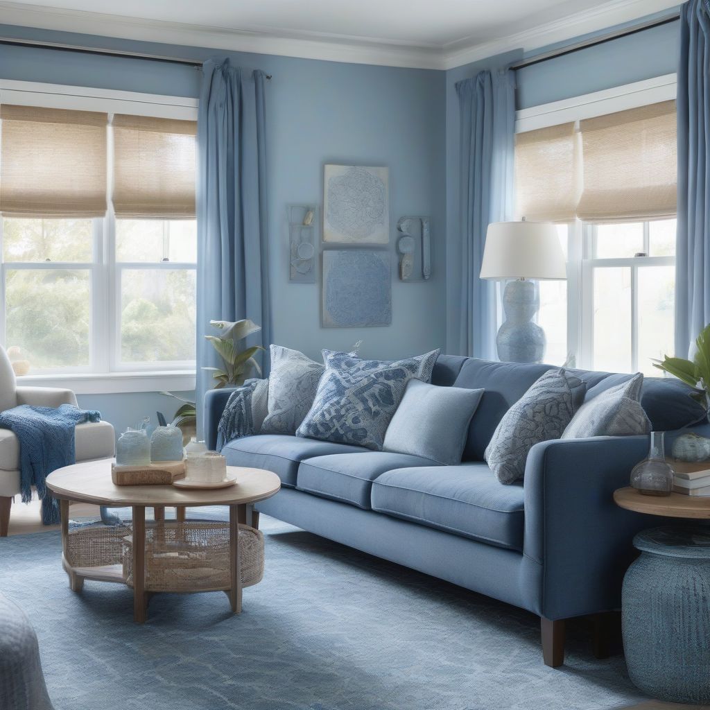
A monochromatic scheme uses variations of a single color, creating a cohesive and sophisticated look. For instance, you could use different shades of blue, ranging from a pale sky blue to a deep navy, for a calming and elegant atmosphere.
Analogous
Analogous schemes utilize colors that sit next to each other on the color wheel, such as blue, blue-green, and green. This creates a harmonious and visually pleasing effect.
Complementary
Complementary schemes employ colors that are opposite each other on the color wheel, like red and green or blue and orange. These pairings create a vibrant and energetic feel, but it’s important to use them in balanced proportions to avoid overwhelming the space.
Triadic
Triadic schemes use three colors evenly spaced on the color wheel, such as red, yellow, and blue. This creates a dynamic and balanced look.
Tetradic (Rectangle)
A tetradic scheme uses four colors arranged in two complementary pairs. This offers a rich and complex color palette, but requires careful balancing to avoid clashing.
The Psychology of Color
Understanding the psychological effects of color can significantly impact the mood and atmosphere of your space. For example, a “Tranquil Dawn,” a soft green, is often associated with nature and tranquility, making it an excellent choice for bedrooms or bathrooms. A vibrant “Living Coral” can energize a living room or dining area, while a deep “Classic Blue” can create a sense of stability and sophistication in a study or home office. “As a color expert, I find that people underestimate the power of color. The right palette can completely transform a space, influencing mood and even productivity,” says renowned interior designer, Jane Doe.
Incorporating Color into Your DIY Design
There are several ways to incorporate your chosen color scheme into your design:
Walls
Painting your walls is the most impactful way to introduce color. Consider using different shades within your chosen scheme for accent walls or to create visual interest.
Furniture and Accessories
Furniture, rugs, curtains, and throw pillows provide excellent opportunities to introduce color and texture.
Lighting
Lighting plays a crucial role in how colors are perceived. Warm lighting enhances warm colors, while cool lighting brings out the coolness of blues and greens.
Common User Queries about Color Schemes in DIY Interior Design
- What are some popular color schemes for small spaces? Lighter colors, such as pastels or neutrals, can make a small space feel larger and brighter.
- How can I choose a color scheme that reflects my personality? Consider your favorite colors and the mood you want to create in the space. Browse design magazines and websites for inspiration.
- What are some common color scheme mistakes to avoid? Avoid using too many colors, neglecting the impact of lighting, and not testing paint colors before committing.
 DIY Interior Design Color Schemes
Conclusion
Choosing the right color scheme is essential for successful DIY interior design. By understanding the basics of color theory, exploring different color palettes, and considering the psychology of color, you can create a space that is not only aesthetically pleasing but also reflects your personality and enhances your well-being. Remember to test paint colors, consider the impact of lighting, and trust your instincts. Now, go ahead and unleash your inner designer! We’d love to hear about your DIY color adventures, so share your thoughts and experiences in the comments below. And don’t forget to share this article with your fellow DIY enthusiasts!


